
Is My Website Responsive? How to Check and Why It Matters for Your Auction
June 23, 2025 - 9:40:05 am
In today's digital-first world, your auction's website is your virtual showroom, your bidding floor, and your primary connection to customers. But have you ever stopped to ask, "is my website responsive?" If this question isn't on your radar, it should be. A responsive website is no longer a luxury; it's an absolute necessity for the success and growth of your auto auction business.
This article will guide you through the importance of responsive design, how to check if your current website makes the grade, and why it's a game-changer for attracting and retaining bidders.
What is a Responsive Website, Anyway?
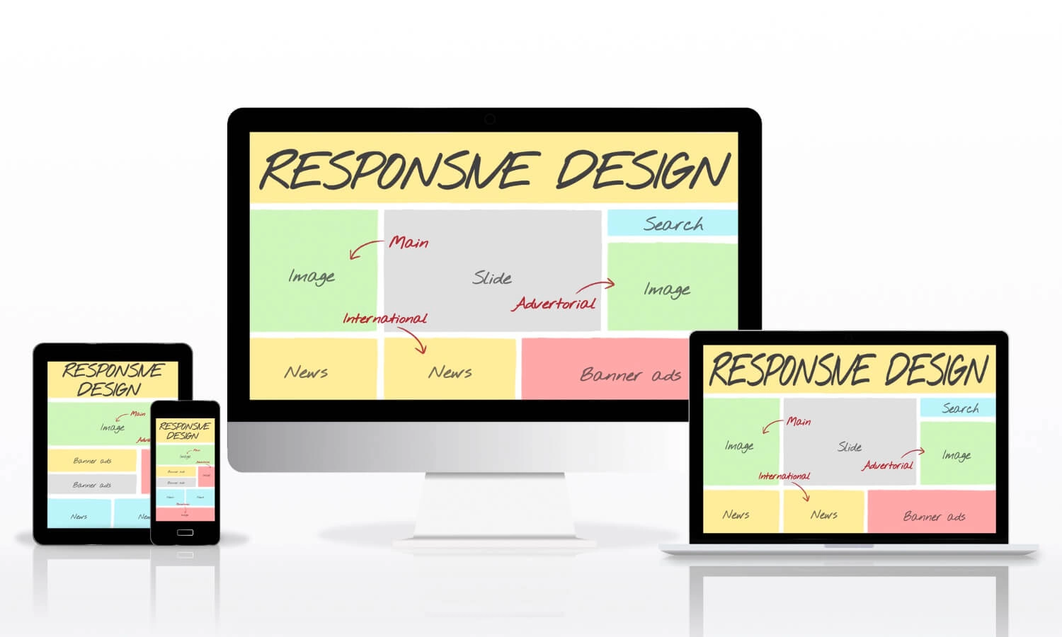
In simple terms, a responsive website automatically adjusts its layout and content to fit the screen size of any device. Whether a user is browsing on a large desktop monitor, a laptop, a tablet, or a smartphone, the experience should be seamless. Text should be easy to read, images should scale correctly, and buttons should be easy to tap.
Imagine a bidder trying to place a last-minute bid on a vehicle from their phone while on the go. If they have to constantly pinch, zoom, and scroll horizontally just to navigate your site, they are likely to get frustrated and give up. A responsive design eliminates this friction, providing an optimal viewing and interaction experience for everyone, everywhere.
Why a Responsive Website is a Must-Have for Auto Auctions
For an online auto auction, the answer to "is my website responsive?" directly impacts your bottom line. Bidders are a diverse group, using a wide range of devices to browse inventory, view vehicle condition reports, and participate in live sales.
A non-responsive website creates a barrier for a significant portion of your potential audience. Mobile users, who make up a huge percentage of internet traffic, will have a poor experience and are unlikely to return. This means fewer eyes on your inventory, less competition in your bidding lanes, and ultimately, lower sale prices for your consignors.
Furthermore, search engines like Google prioritize mobile-friendly websites in their search results. If your site isn't responsive, you're not only frustrating users, but you're also hurting your visibility in online searches, making it harder for new buyers and sellers to find you.
How to Check: Is My Website Responsive?
The good news is that you don't need to be a tech wizard to check your website's responsiveness. Here are a few simple methods and tools you can use.
- The Manual Resize Test: This is the quickest and easiest way to get a basic idea. Simply open your website on a desktop computer and grab the edge of your browser window. Click and drag to make the window smaller and larger. As you resize it, watch how the content on your page reacts. Does the text reformat? Do the images resize? Does the layout change to a more vertical orientation for a narrow window? If the content simply gets cut off and a horizontal scrollbar appears, your website is not responsive.
- Use Your Browser's Built-in Tools: Most modern web browsers have built-in developer tools that can simulate how your website looks on different devices. In Google Chrome, for instance, you can right-click anywhere on your webpage and select "Inspect." Then, look for an icon that looks like a phone and a tablet, often called the "Toggle Device Toolbar." This will allow you to see how your site appears on various popular smartphones and tablets.
- Free Online Responsive Checker Tools: There are numerous free online tools available where you can simply enter your website's URL, and it will show you previews of your site on different screen sizes. These tools provide a quick and comprehensive visual check.
Tips for Fixing Responsiveness Issues
If you've discovered your website isn't responsive, it's crucial to address the issue. A professional web development team can help you implement a responsive design. They will focus on:
- A Fluid Grid Layout: This allows the elements on your page to resize in proportion to the screen size.
- Flexible Images and Media: Ensuring that your images and videos scale correctly without distorting or slowing down your site's load time.
- Media Queries: These are special CSS rules that apply different styles based on the characteristics of the device, such as its width, height, or orientation.
The Auction Streaming Advantage
At Auction Streaming, we understand that a seamless user experience is fundamental to a successful online auction. That's why our industry-leading platform is built from the ground up with responsive design at its core. We ensure that your auction website, powered by our software, provides an exceptional experience for every user on every device. From browsing listings to participating in live simulcast auctions, your bidders will have a smooth, intuitive, and engaging experience.
Don't let an outdated website hold your auction back. Take a moment to ask, "is my website responsive?" The answer could be the key to unlocking a larger audience, higher bids, and greater success in the competitive world of auto auctions.
To get more insights visit our Blog page!